Project List


Problem:
Obviously, magazines for the STGW-57 in the US aren't exactly cheap. On top of that, they're not optimized to feed .308 Winchester. This project looks to solve that by providing a cheaper alternative specifically tailored for .308 Winchester. According to others that have .308 conversions, 7.5x55 Swiss magazines seem to work, though I don't personally like it for a couple of reasons:
1. The taper of .308 is different than 7.5x55 Swiss.
2. The overall length of the cartridge is much shorter.
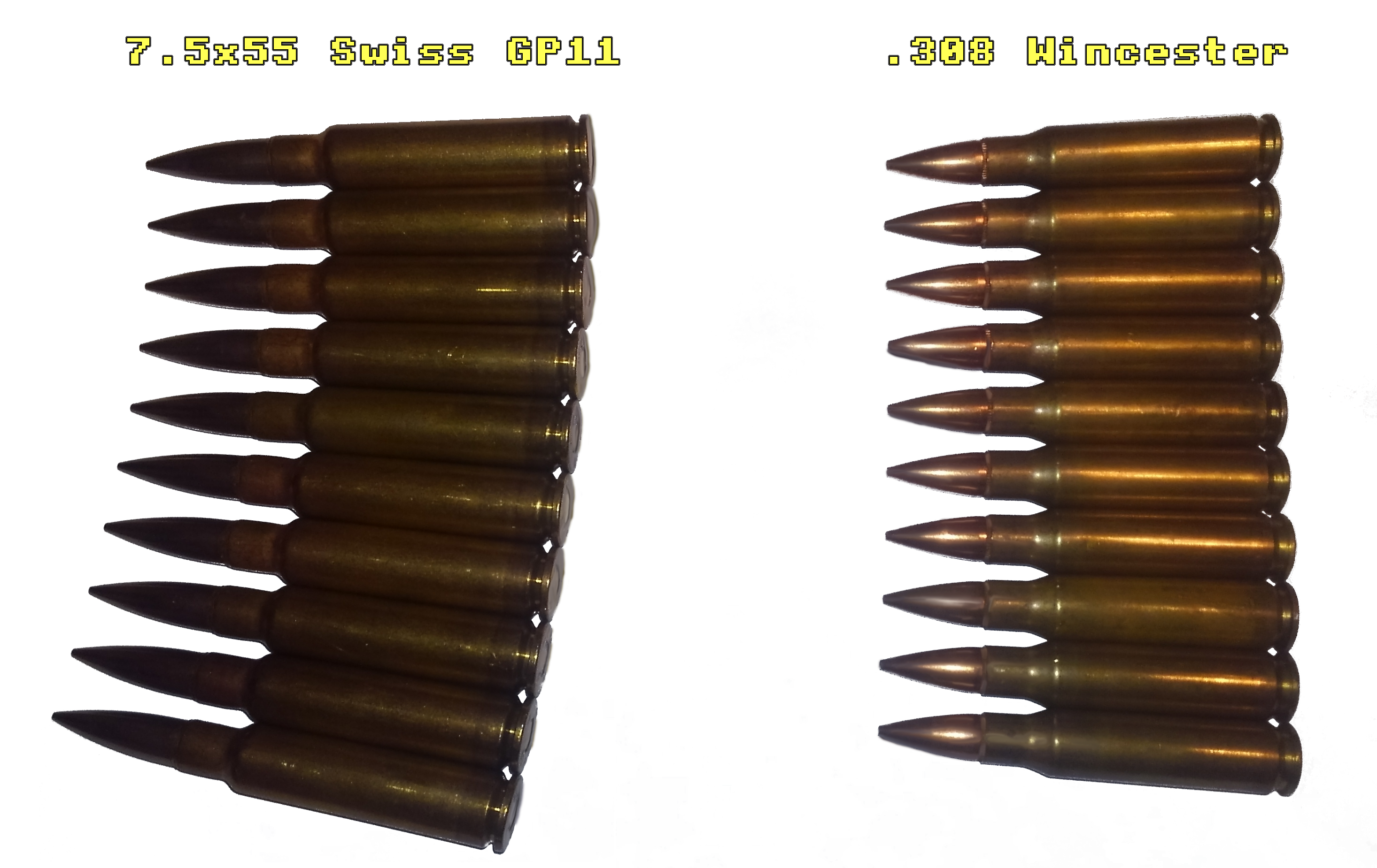
These two factors combine to make a less than repeatable presentation of the cartridge when loaded into the 7.5x55 Swiss magazine. The first problem is that the .308 is forced to follow the curvature of the magazine. The curvature of the magazine is normally dictated by the taper of the cartridge. In the case of an incorrect taper following the curvature, the cartridges aren't going to rest along each other's bodies. In this case of excessive curvature, the cartridges will pivot about their transition to the neck.
Eventually, this leads towards the feed lips of the magazine exerting most of the pressure towards the front of the body of the cartridge, and due to how the cartridge is supported, the body doesn't sit flush against the feed lips and the head of the cartridge is lower at the rear of the magazine. The severity of the angle between the body and feed lips changes depending on how many cartridges are loaded, the more loaded it is, the greater the angle. This is the first inconsistency in the presentation.
The next problem, the overall length of the cartridge being shorter, adds another layer to the inconsistency. The shorter length of the cartridge affects the presentation since the cartridge can freely slip forward changing where the bolt initially contacts the cartridge during loading. Another effect is that during the transition from the magazine to the chamber, there comes a point where the feed lips stop supporting the cartridge and the rear is free to come up and align with the chamber. If the cartridge is shorter, the feed lips should control the cartridge closer to the chamber to prevent the cartridge from flopping about and not being able to align with the chamber.
Options:
Our options fit into two main categories, modify an existing magazine or making a new magazine. Making a new magazine in a low quantity and having it be of a good quality would most likely make it very expensive due to the amount of set-up required. Next, we could try some modification to the original STGW-57 magazines, though even if that fixes all of the mechanical issues, the base magazines themselves are still expensive. That leads us to modifying another existing magazine.
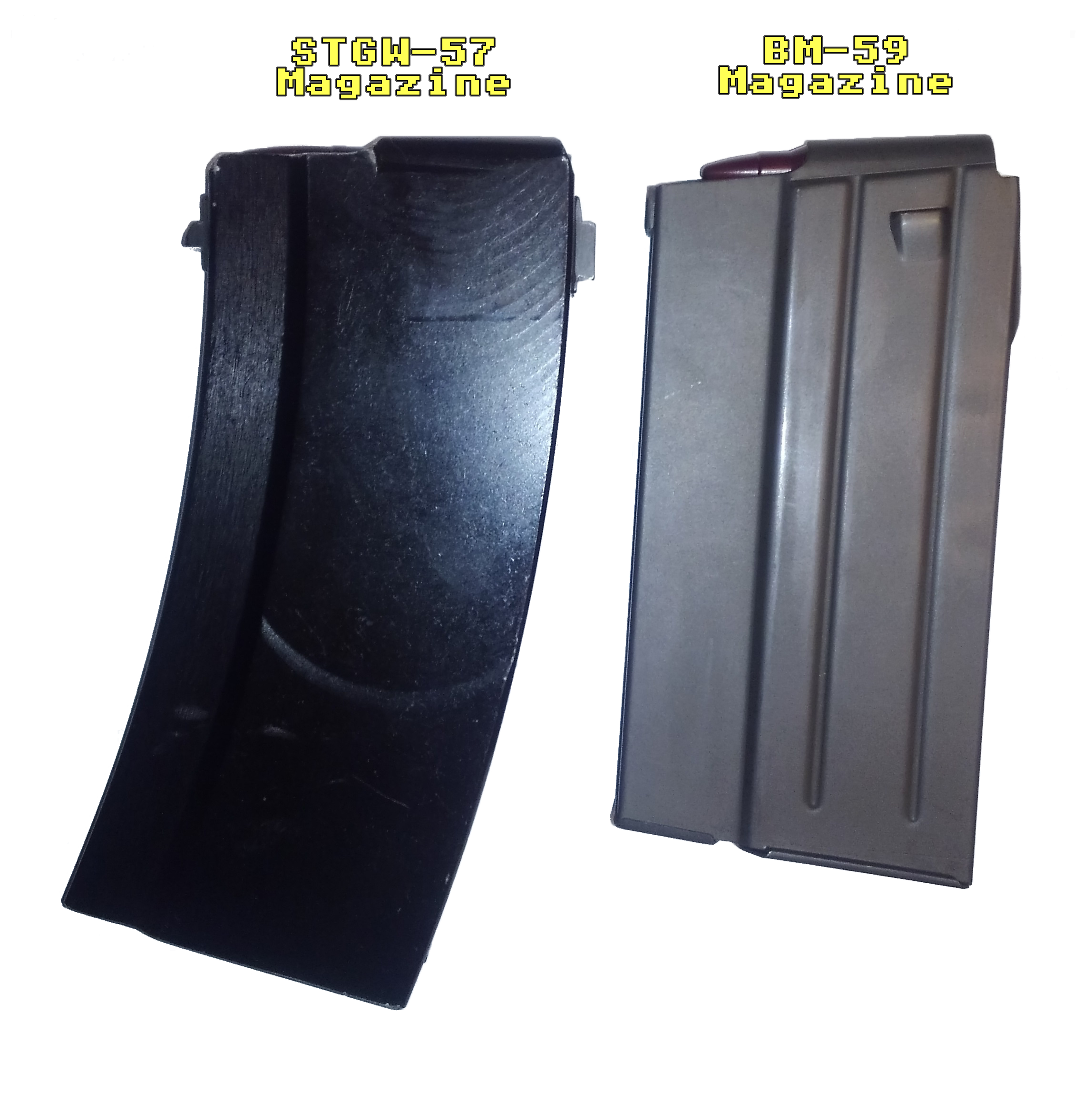
When choosing a magazine, we have to look for a few properties. The front of the STGW-57 magazine suddenly narrows at the front and has a portion in the trunnion that matches. This restriction either limits our magazine selection or requires a modification to the trunnion. I'd prefer to leave the trunnion alone as much as possible, therefore the requirement of the sudden transition at the front leaves us with two main available .308 surplus magazines:
• BM-59 Magazine
• .308 galil Magazine
Comparing the two, the BM-59 magazine is more available, cheaper and upon inspection generally seems to be better built. Something about the .308 galil magazines, especially their finish, seemed chincy. Once I decided on the BM-59 magazine, I compared the dimensions with the STGW-57 magazine. I'm happy to report that they are absurdly similar. Using digital calipers I found that by comparison to the STGW-57 magazine, the width at the rear is 0.5mm less, the narrow width at the front is 0.1mm less, and front to back it's 0.3mm less. I honestly couldn't ask for a better fit. The fact they're all slightly less is good too since we can always add material if we need to, reducing a dimension is obviously quite challenging with a hollow stamping.
Solution:
So with our goal of getting the BM-59 magazine to fit, align, lock and feed in the magazine well of an STGW-57, we'll have to make a front and rear tab and attach them to the magazine. I decided welding would be the easiest option, and I made sure all cuts for the parts could be made with a 90° end mill. I thought using a dovetail cutter might be necessary but it isn't. For assembly, besides the tabs themselves, you only need a block to set the height of the rear tab. The front tab is indexed off of the existing front magazine tab. The main steps are to prep the weld areas of the magazine, align tabs, tack, and weld. You can finish the tabs and weld area however you want. I believe the BM-59 magazines are phosphated, though I'm probably just going to cold blue the tabs and weld area for corrosion resistance.
You'll also have to do something about the two rear over-insertion stops on the side of the magazine so it can fit into the STGW-57 mag-well. For the sake of several different methods being viable, I'm just going to leave that portion out of the instructions. Personally, I'm just going to cut them off as a small gap isn't going to affect function. If you'd prefer you can weld a small sheet of metal over the gaps once you cut the over-insertion stop out and chamfer the tops so it doesn't get hung up on insertion. Keep in mind you've only got 0.25mm of width you can add to each side. Alternatively, you can ignore removing them altogether and find some way to bend them back flat. Instructions for fitting and tacking is included in the third page of the combined PDF.
Downloads:
Download the files by clicking the links below or view in the frame.
ZIP Package with PDF and CAD
PDF only Download

Problem:
If you've got a 7.5x55 STGW-57 parts kit and a .308 barrel, you've probably noticed the problem that the end of the jacket is no longer supported by the barrel. This would be fine if the jacket were fairly rigid like a free-floated rail system, though it's a thin aluminum tube riveted to a part that is screwed onto the trunnion. This means that the front sight is free to wander with the unsupported jacket. Even if you don't plan to use iron sights, you should still fix this problem because the barrel can whip into the jacket while firing or vice-versa, which at the very least would lead to finish wear and dings.
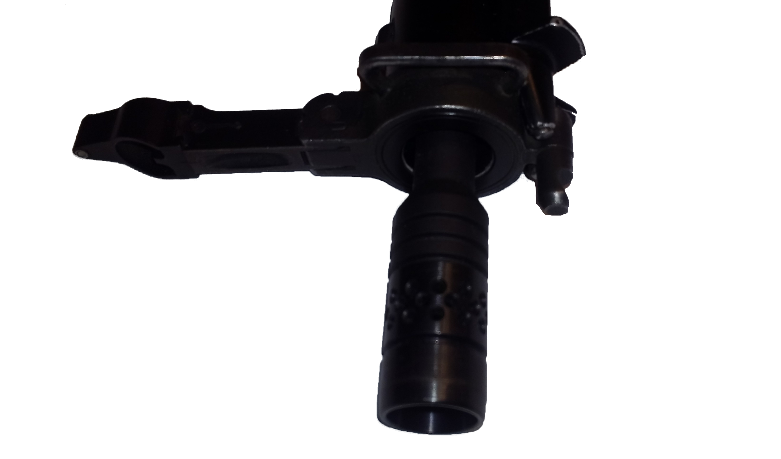
Options:
Obviously, we want to jam something between the barrel and the jacket to align them and transfer forces between them. The easiest solution would be a split tube that butts up against the chamfers of the muzzle brake and first grenade launching ring. However, I'd like to have nothing protruding past the end of the barrel jacket. This means we need either a friction fit or to touch off of another surface to stop our sleeve from sliding forwards. While this could be made from aluminum, steel, or plastic should do the job just fine. While it should be machineable, it would probably be easiest to be 3-D printed.
First Solution:
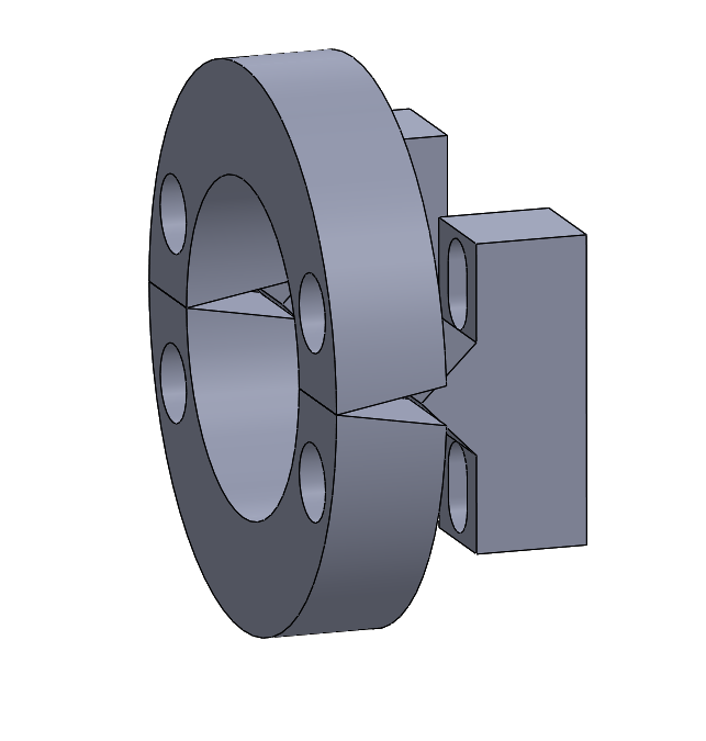
The first thing I tried was using a wedge that when screwed closer, would open up the split ring giving a friction fit against the jacket. This ended up not being feasible due to the difference in diameter between the jacket and barrel not leaving enough room for any decent sized bolt.
Second Final Solution:
This implementation relies on using a step on the inside of the barrel jacket to interact with the chamfer on the O.D. of our part to stop the sleeve from sliding forward. I have a slot for an O-ring (115 O-ring, 11/16" I.D.) to help with both keeping it together during assembly and for better fitment between the jacket and barrel. Keeping it together during assembly is important because it has to come from behind the jacket, meaning you've got a nice ~18" narrow tube you've got to guide it down, so it's best just to let the O-ring hold it onto the barrel. You may have to experiment with the depth of the groove, though I have it set in a slight slot right now. It also doesn't need to be heat resistant since whatever material you print will be a problem before the o-ring. I intend to 3-D print this, when I do I'll update this project with what I learn from it.
To download the CAD files, click the link below:
ZIP PackageConstruction Zone, Slight update:
Well, I've got my pizza delivery tracker for the 3-D printed part.

However, I neglected that people might also want a part that takes advantage of 3-D printing specifically and that I wouldn't need this extra design to be machinable. Below you can see that design and how it relies purely on the grenade launching ring to index and would work more consistently as the depth from the jacket to ring might vary from assembly to assembly. By a quick look, you can tell getting those internal features wouldn't be easy. You could use a boring bar but I don't think it wouldn't be worth the extra effort over the other version.
Download:
I'll try to get this one printed as well and you can download the files below:
3-D Print Optimized ZIP

To download the PDF/CAD files, click the links below:
PDF Only
ZIP PackageIf you're on a desktop browser you can just use the frame below to view/download the PDF.
Disclaimer: I did not make this particular drawing/package. It was sourced from a publicly listed library for resources related to the STGW-57.

Enjoy, You Won't Find This Anywhere Else.
This is a project I've been working on for a while. Anyone that's started on this themselves has probably realized their parts kit only has the receiver pieces that are attached to the trunnions, which leaves you with a lot of missing information. It took a lot of work and researching to get all this together as well.
The receiver is fabricated from two split sections for ease of manufacture, which are plasma cut from a flat, and bent afterwards, and the trigger group wings are fit through the slots and are welded on. The most complicated section of the build is the cam surface for the ejector, which I recommend building how I have here, and welding the cam section on, otherwise you'll need some pretty specialized tooling/dies. Additionally, if you want to go the route of machining this, you'll have to build a shell around the outside to support it while machining, though with the receiver shells split, it is possible.
Sample Images
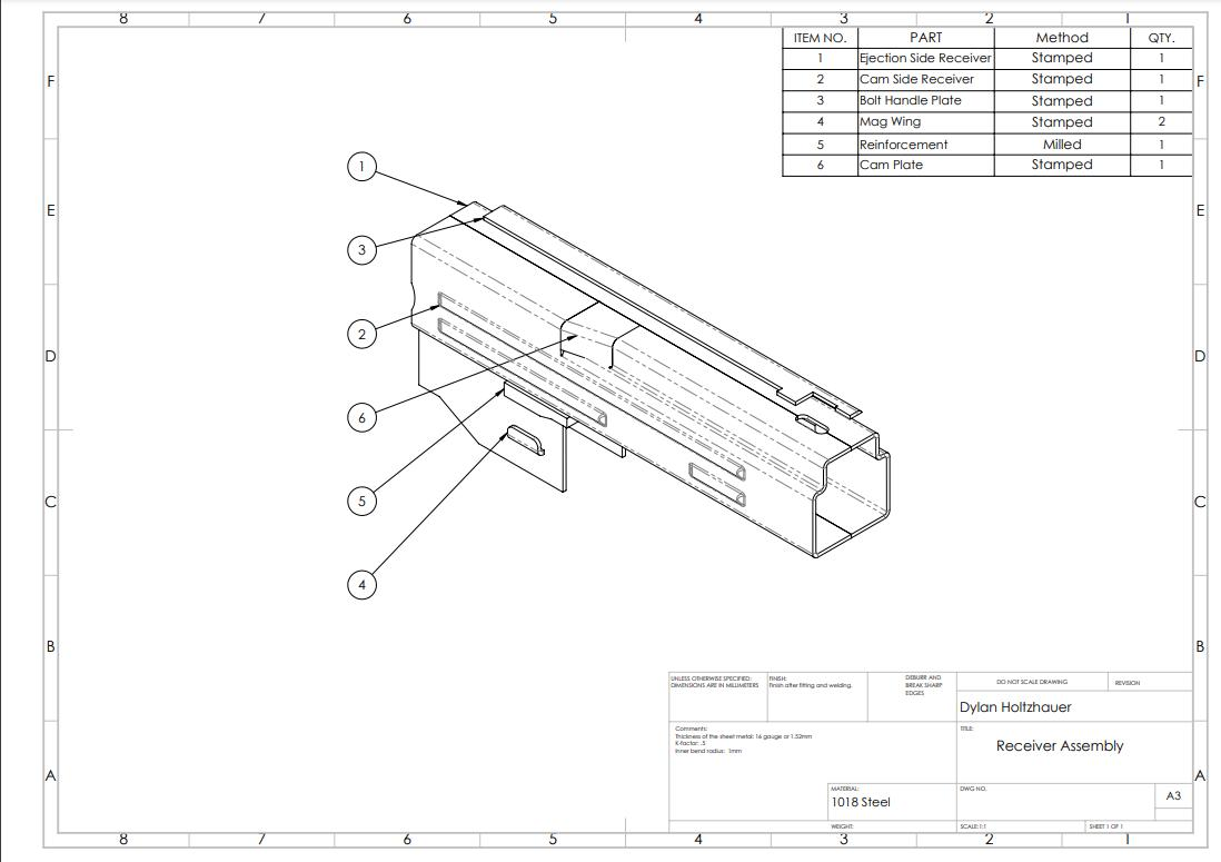
Drawing of the full assembly.
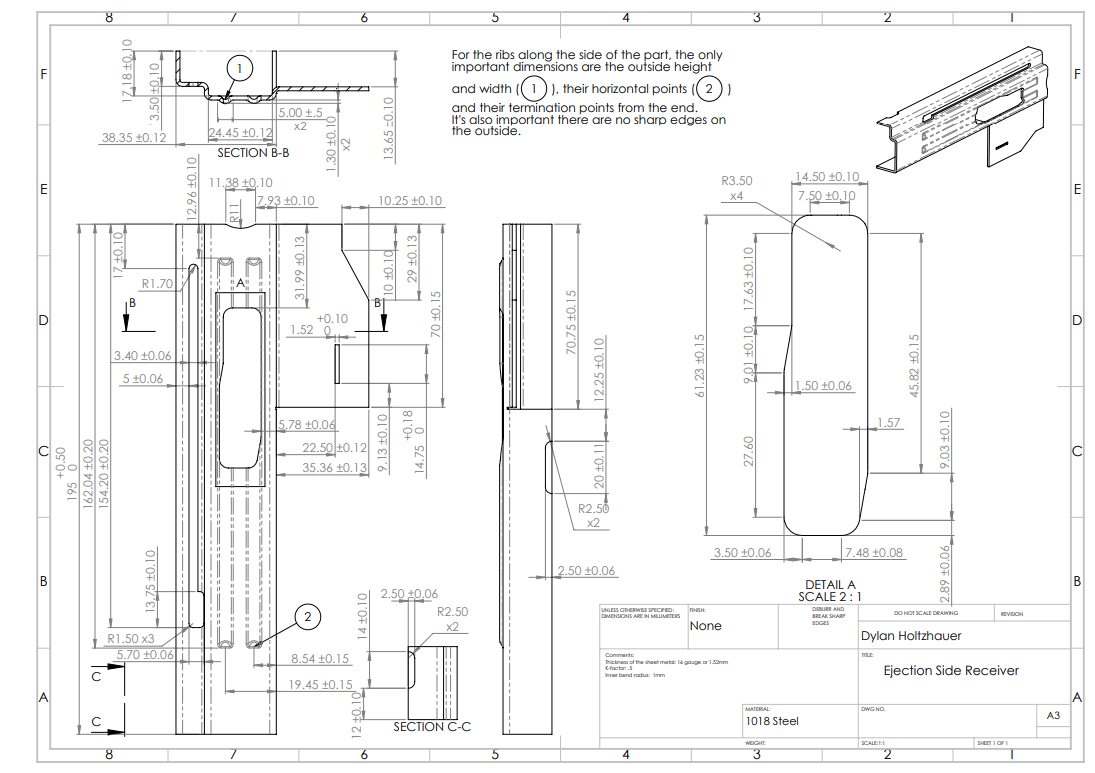
Drawing of the bent ejector side of the receiver.
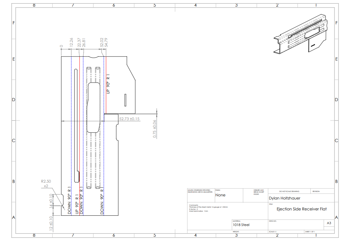
Drawing of the ejector side receiver flat with bend lines.
Full Package Download
To download the PDF/CAD files, click the links below:
Full STGW-57 Receiver Package DownloadIf you're on a desktop browser you can just use the frame below to view/download the PDF.


Problem:
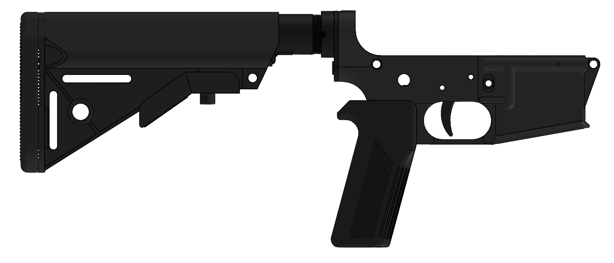
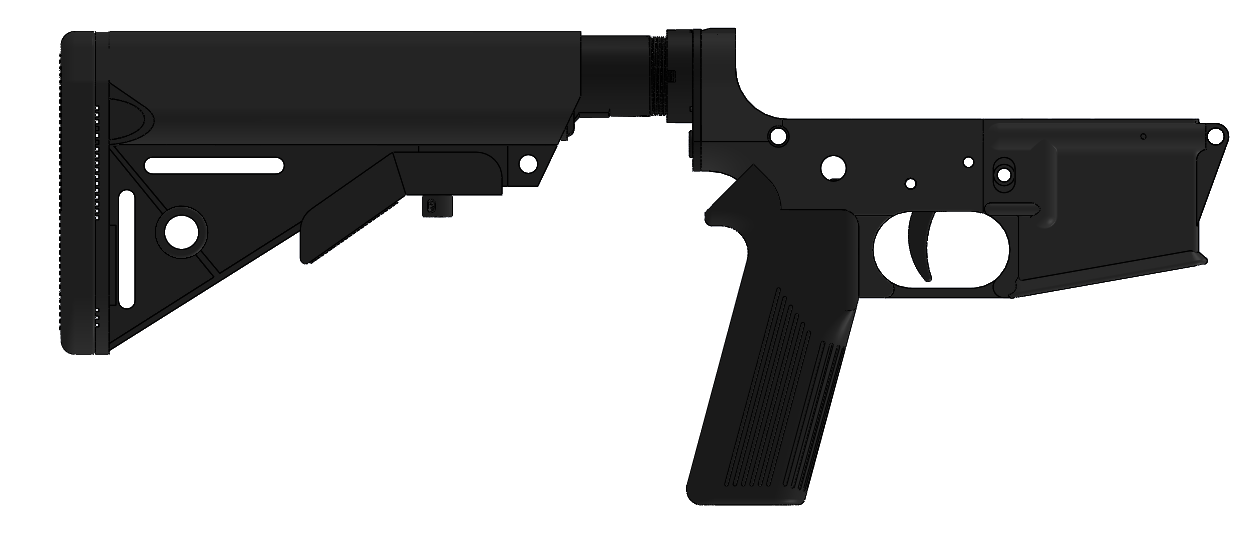
I wanted a pistol grip for an AR-15, it's that simple. I do like the "Battle Grip" from HK, though I decided I wanted something a bit more unique. The pistol grip doesn't have significant stresses applied to it, it essentially just needs to survive being banged around. With that in mind, I believe it's fine to 3-D print it.
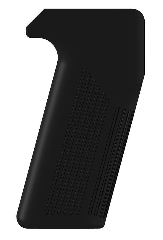
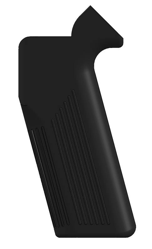
The main thing to keep in mind when designing this is to make sure you can still assemble it. This is a concern because the grip angle isn't perpendicular to the mounting surface, so the bolt that screws into the lower receiver needs room in the off-angled grip to insert through the mounting hole. You can look below to compare the angle of the grip to the mounting surface.
Solutions:
I designed two slightly different grips with the main differences being where the top of the web of your hand goes and how the top mates with the lower receiver. The flat-topped one is more faithful to the original grip and better replicates the web to trigger distance of the actual STGW-57. The one with the angled top moves your hand up a bit and looks a little less goofy when on the receiver.
Downloads:
To download the CAD files, click the links below (Images below show how they look on the receiver):

Explanation:
Many larger gun tubes are built up or auto-frettaged, which means they have an internally induced stress in the tube that has to be overcome on top of the original material's strength. In this project, I did the work pertaining to calculating the required geometry to for an optimized built up barrel. Auto-frettaging is overpressurizing the tube such that the inside plastically deforms, and the outer portion pushes inwards on the outer portion. A built up barrel uses two tubes, where the OD of the inner tube is slightly larger than the ID of the outer tube, and the out tube is heated to fit over the inner tube, and when it cools, it shrinks around the inner tube, inducing a stress. Basically, you get a negative stress towards the inside of the barrel, and a positive stress on the inside of the outer tube, but since the outer tube region will naturally experience less radial and hoop stress, you can find a balance point of having the inside of the outer tube and inner barrel wall with equal stress when the barrel is under pressure.
Below is a plot of the stresses in the built up barrel. It can be seen the peak stress of both the inner tube and outer tube is 4.20x10⁸ Pa or 420 MPa, as opposed to the original 8.20x10⁸ or 820 MPa experienced by the monobloc tube.
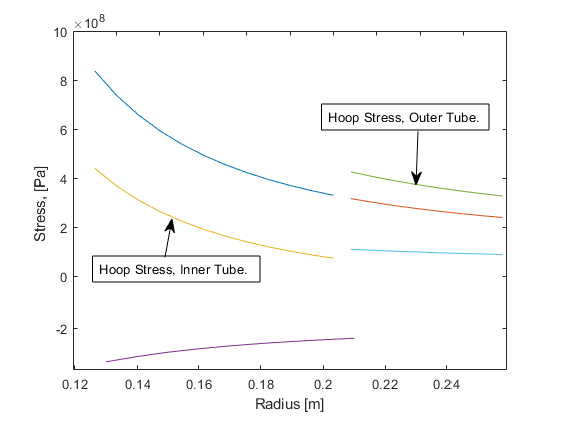
(The dark blue line and orange line are the monobloc barrel stresses, while the purple and light blue are the internally induced stresses for the inner and outer tube. Adding the monobloc stresses and internal stresses together gives you the built up barrel stresses.)
This ultimately allows you to build a much stronger/lighter barrel. The lighter the barrel, the less weight the trunnion needs to support, keep in mind all that weight is hanging meters out in the air, and it also lessens the deflection of the barrel under its own weight since it is lighter. Other considerations is the reduction in weight will also allow the turret/trunnion to be rotated/adjusted faster given the same force from the actuator.
On top of the work shown above and the work in MATLAB for it, I calculated the cost and time of heating the barrel so it could be assembled, while the coating of the barrel, and testing procedure for it was covered by other group mates.
View and Download Report/MATLAB Files:
To download the PDF and MATLAB file, click the links below:
PDF Download
MATLAB Download
If you're on a desktop browser you can just use the frame below to view/download the PDF.


Reason:

I wanted a unique and interesting icon to use as a theme for this website and other related projects. I saw the Risen song theme by Terry A. Davis and was oddly impressed. While some people aren't sure who exactly made it, as the main artist hired by Terry mentioned that he didn't know who made it, I can pretty conclusively say that it was a demo made by Terry as he was very good with crediting work, so the lack of a source means it was him. Additionally, other art used on the OS that isn't made by Terry rarely has any programming attached to it, just static sprites for the most part.
What I liked about the original Risen theme was that it had smooth mesmerizing movement and simple yet sharp colors and models. Additionally, there is the probability dithering for shading that makes a look that is hard to emulate on other software. I tried using Solidworks to make a model and image editing software to emulate the dithering based on shading intensity, though I didn't like the result. Moreover, it was just a static image.
From here I decided that the best way was to simply use Temple OS. Despite having no experience with Temple OS beforehand, I was able to find plenty of help through the community (additional thanks to Matias and Rendello) that still exists around Terry and his creations. Keep in mind with all things Terry related, you need a thorough mental filter and a good understanding of what Terry ultimately stood for. To even attempt that you need a decent understanding of mental illness as well. If you don't tread lightly you're liable to adopt a more hateful than loving ideology.
The Base:
The origin of the Risen theme is in the first supplemental pack for Temple OS. The particular file is "TOSTheme.HC.Z" which is located in the Sup1Graphics folder. For official Temple OS downloads, you can visit the download page of TempleOS.org and download both Temple OS and the first supplemental pack. It's your choice which virtual machine you want to run it on, or even if you want to run it on dedicated hardware.
*CAUTION* The video is loud, it is automatically muted. *CAUTION*
*CAUTION* The video is loud, it is automatically muted. *CAUTION*
The basics of it are 3-D meshes that rotate in X, Y, and Z; and 2-D sprites that scale, both of which are functions of time. There's a little more nuance in drawing the birds and the scale lines, though, in respect for how long this project is and the fact I'm either not editing or not using those elements, I'm leaving those out of this project write-up. If you un-muted the video you surely heard the rather loud single instrument music. I didn't lower the volume for the sake of keeping it as similar to Terry's original work for the best representation of what TOSTheme.HC.Z is, for your "enjoyment" of course. There's also the clipping that happens when it loops; Unfortunately, I won't be going over that as I forgot how I fixed it.
My Work:
• 3-D Meshes
The first thing I decided to do was make the 3-D meshes for use in the animation. Obviously, we'll be using the built-in graphics editor to make our meshes as trying to import them is way beyond the scope of what I'm looking to do. Interestingly in TOS, the program doesn't link to a file path for the mesh that you have saved as a file elsewhere, it's actually saved and editable in the program. Terry mentioned that to use the 3-D mesh editor you need to be a glutton for punishment, though once I got the basics down it wasn't that bad; Maybe it's due to the simplicity of the meshes I made.
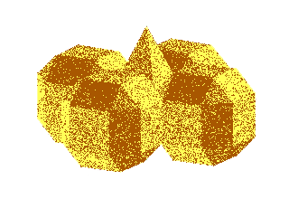
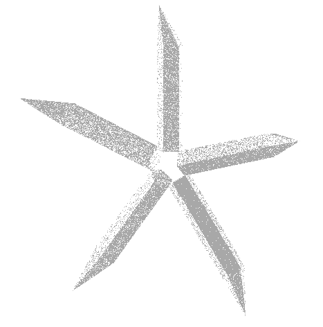
Sidenote, to edit an existing mesh, have your cursor selection over the text representation for the mesh you want to edit, press
"ctrl+r", then on the right side of the graphics menu, then select the mesh. Now you can go on to use the left menu to edit. Even if you're making your own mesh from scratch you'll need to do this since you're human and are bound to make mistakes (Save, Save, Save!), especially when you're working with the rather finicky mesh editor.• Code Additions
Starting out, let me post this image below for reference. It'll be nice to look back to as you're viewing the other portions of the code I'll be going over.
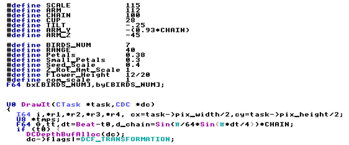
So I wanted to make the code somewhat my own, rather than just switch out a few assets and tweak a few variables. I decided I wanted the meshes to be animated in some way other than just rotation. Essentailly, I decided I wanted vertices to move in relation to each other during the animation and that certainly wasn't done in TOSTheme.HC.Z . After some research, I figured out a way to do it, though first, we're going to go over how it was done originally.

Basically, it defines the identity equation for the matrix sets the X, Y, and Z coordinates and its rotation in X and Z.
"Sprite3"uses the modified matrix on the mesh for it to be drawn as you've defined it. Now, this was removed due to the fact I was looking to add those features I mentioned in the previous paragraph. Below you can see my iteration of it and explanation of how those features were added.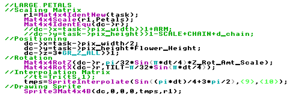
So I've cleaned it up a bit for the purposes of this write-up, I apologize that the rest of the file isn't, though the other examples of drawing the mesh are pretty much the exact same, but with the variables changed out for the defined integers for scaling and the mesh files themselves. Moving on, from the start you can see
"r1"is set as a matrix. Earlier in the file"r1"was defined as a 64 bit integer string."Mat4x4Scale"takes the r1 matrix and Petals input. The Petals input was defined as an integer earlier in the file, in this specific instance, it is 0.38, which scales the Large Petals mesh to 0.38 of its original size. This was the first thing that required"r1"to be defined by I64.The next step is setting up the identity equation for the matrix, which lets us set its position and modify it in other ways similar to the previous example. The next three lines are defining the mesh's origin point with respect to the X, Y, and Z axis. The out of place variable in the Z axis,
"GR_Z_ALL", to my knowledge sets it above other background entities. (You can imagine the Z axis as coming out of the screen with how we have our view set.) If this isn't done there is a chance the mesh flashes in and out while being drawn.The positioning is more or less the same except
"Flower_Height"which was an additional variable I defined as a constant. The rotation is also very similar with the addition of"Z_Rot_Amt_Scale".The next part is the Interpolation matrix which is the main addition I made. It's the other part that required defining
"r1"as a 64-bit integer string. What"SpriteInterpolate"does is draw a unit vector between each moved vertex on an edited mesh you make. You can also see that the line is referencing two different meshes, one is the original straight petal mesh while the other is a copy and paste of that mesh that I edited so that the tips of the petals were bent. To use"SpriteInterpolate", you must make the derived mesh as an edit to a copy. If this isn't done it doesn't understand what vertices you want to be linked between the different meshes. You also can't add any vertices to the edited mesh.From there it takes a constant to place the vertex somewhere along that vector via linear interpolation. Interestingly you can use a constant greater than 1 and less than zero. I took advantage of this by using
"Sin((pi*dt)/4+3*pi/2)"which dips into both the positive and negative as a function of time. This way I only needed to make 1 modified mesh, which I rotated the ends of the petals 10° about the center. When you see the animation you'll notice the tips bend both ways despite only there only being a straight petal mesh and a single bent petal mesh. The function is also timed such that the tips trail the main petals in a way that looks like they're being dragged and have mass with rigidity.The rest of the code for the other meshes are the same for the most part. There are different constants used for the scaling of the small and large petals since they reference the same meshes. There's also 2-D text sprites for "Project-Temple" and "Project-Temple.com" that were imported as .BMP's. The process for importing .BMP's is long and annoying; I may do another write-up on that topic alone in the future, but if I haven't and you want to know how just email me.
• Minor Changes
Towards the end, I decided to change the background color to the darker
"Cyan"rather than"LtCyan". A small and simple but important change. I also added my own music. I kept the same spirit by having it be a single instrument, though I opted to use a modern MIDI editor on Windows. While the grating monotone notes have a certain appeal to some, it is like nails on chalkboard to many others. If you want to have a guess at what song it is you can shoot me an email for that too.
Result:
Intro:
Outro:
Making: Project-Temple Logo
Overall this was a fun primer for Temple OS. While nothing I did was particularly groundbreaking, it did give me experience with an obscure operating system. Merely getting aquainted with the command line, switching directories, mounting disks, moving files, editing/running programs, and other simple tasks, it was quite the adventure only having had experience with Windows beforehand. If you are even considering doing a project in Temple OS for any reason, I highly recommend it, though please do use the tour once you get it installed. In a lot of ways making/editing this program reminded me of MATLAB, which Terry does credit as having affected choices he made while developing Temple OS. I did some extra learning about C and specifically Holy C as well. In the end, I got a pretty sweet unique looking logo/theme for projects in the future, which was the initial goal I set out to do in the first place.
Downloads:
Simply click the links below to download the files. There are really only two files, one with the extension ".HC.Z" and the other with only ".HC". The ".HC" file extension is mostly editable in a .txt editor like Notepad++ while ".HC.Z" is the compressed format that Temple OS uses. Both can be imported and edited in Temple OS; However, there's the ".ISO.C" which is the disk you can mount to Temple OS to import the files from, the ".ISO.C" contains both the ".HC.Z" and ".HC".
• Project-Temple Logo Animation (.HC)
• Project-Temple Logo Animation (.HC.Z)
• Project-Temple Logo Animation (.ISO.C)

Coming Soon

Problem:
I wanted a place to share work from my personal projects. For several reasons, I decided my own website was the best way to go about that. To get up to speed about the basic design philosophy, you can check out Project-Temple.com/Design-Philosophy which goes over basic principles that affect the design of this website. This particular writeup will go into more specific detail of things I specifically choose to avoid or add, though it will reiterate some topics.
Things I do like:
If you're not looking to view the design philosophy page, the main tenets are that the website should be:
• Clean and easy to navigate.
• Easy to understand and edit.
• Able to work across a variety of platforms.
Things I don't like:
• Reliance on External Sources
To many, this is obvious, though that doesn't stop the popular culture in general from ignoring it. What I mean in the context of this website is that I'm looking to avoid linking to external sources for content as much as possible. I don't want to rely on javascript or images that are hosted somewhere that is not under my control. People take for granted that those sources will always work, after all, they're so ubiquitous and widely used, how could they ever possibly be allowed to fail? This fallacy even extends to things like wordpress plugins. We all know reality has the capacity to ignore how important things are to people, so being self-sufficient (to a degree) should be a trait that is strived towards, even in the basics.
• Use of Large 3rd Party Libraries
Even if these libraries are locally hosted, there's a learning curve to using them. This goes against the concept that the website should be easy to understand and edit. Normally these libraries are used to achieve simple tasks that can be done in plain and easy HTML and CSS. They require a little more work normally, but they pay off in that it's likely to be far more versatile. The reason it's going to be more versatile is that a) you made it, you know how it works b) you're likely coding in a more general sense. A library is likely to be optimized for solving hundreds of small specific issues out of convenience, so even if the code is implemented in a janky way, people accept it so long as it solves a specific problem, though they don't care if it's translatable to a similar problem. Due to those things, if you avoid using 3rd party libraries, you're able to make simple edits and get widely varied results, therefore your coding is more versatile and future-proof. Short term it seems better to find a publicly available one-off solution in a library, but historically for the long term, we know that is rarely the case.
• Moving Things!
This one is far pickier, but I hate it with all of my soul. Apparently somewhere along the line, it was decided that 'things moving = professional'. My most hated example of this is parallax scrolling, specifically the enormous background image that takes up the entire top half of the page and scrolls at a different rate than the rest of the page. Just end me, honestly, practically every "modern" website has followed this atrocious trend. For starters, it adds nothing. It's like going to a dancing competition and trying to impress everyone with a handstand, nobody cares and nobody is impressed if you're over the age of 8.
Worse, the actual important thing is that it disregards the fact that a website is a tool, I don't want to scroll down an entire page EVERY TIME to get to the content I actually care about. Imagine the collective time you're wasting by making every visitor scroll past some generic architecture image or stock hi-res photo of a mountain that someone whacked out the saturation sliders on. Keep in mind that the visitor has to go through this every time, even if they somehow thought it looked nice the first time, 40 times later they're going to be tired of it.
What movey bits are there on this website? Pretty much the arrows on the dropdown menus on this page. Keep in mind the actual drop-down itself doesn't have an animation. I've actually taken into consideration the reason you're here is the content of the drop-downs, not my ability to waste your time by making them animate open. I suppose you could consider the main button on the home-page having a fade as an animation, though like the rotating arrow it doesn't actually affect your ability to consume the content, even for a millisecond. Additionally, when you go to the home-page, the content you want 99% of the time is a single click away, no menus, scrolling, or confusion.

Explanation:
Below is a controller design process for a rolling mill. One controller was designed using a root locus, while the other was designed using Bode plots. There's also my opinions my preferences between the two methods, and comparison of the results from each method, mostly their temporal responses like rise time, damping ratio, overshoot, natural frequency, and responses to an incoming fluctuation.
It also covers the selection of variable parameters, and even tests the robustness of the controller by changing the paramters, and seeing how the controller responds.
View and Download Report:
To download the PDF, click the link below:
PDF DownloadIf you're on a desktop browser you can just use the frame below to view/download the PDF.

Explanation:
Below is lab I completed in university, which was comprised of experiemetnally finding values for defining parameters, like damping and friction coefficients, then modeling a cart sliding on linear rods that had a pendulum with a mass attached riding on the cart. It was done in cooperation with Jason Lagoa who did the linearization of the system for a simplification of the response, while I did the modeling and analysis of the original and linearized system in Matlab with Simulink. Normally I wouldn't add something like this, but I found the similarity of the modeled response to the response of the actual system too cool to pass up. I'll put a picture below, seriously it's wild. The only real difference is the fade out, which implies the experimentally calculated values for friction and damping are likely off. The close to chaotic motion in the beginning is modeled extremely closely, in other words the suddent change in movement from the interation of the pendulum swinging on the moving cart.
Plot Comparison:
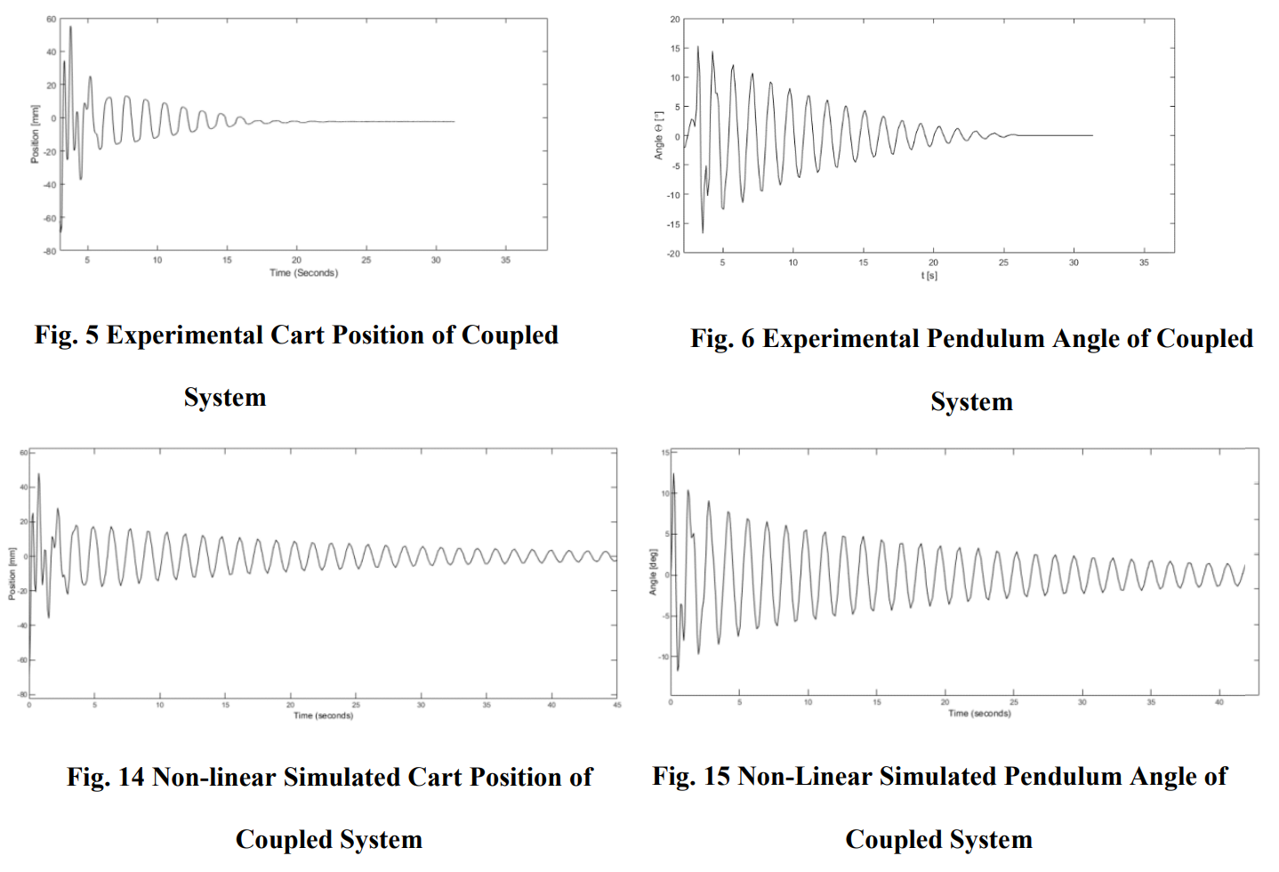
Two upper plots are the experimental results, and the two lower plots are the simulated responses.
This was one of my first experiences modeling an actual system from real life, and I was amazed with how well minute differences carried across in the simlation. Ultimately this increased my love for control/dynamic systems and even got me reading books like "Nonlinear Dynamics and Chaos" by Steven Strogatz. I still find my interest in control systems interesting since I never liked my calculus classes, but actually forming and solving ordinary differential equations to model systems and calculate paramters for requirements was something I really enjoyed in my controls classes. In other words, my favorite subject ended up being almost entirely comprised of my least favorite.
View and Download Report:
To download the PDF, click the link below:
PDF DownloadIf you're on a desktop browser you can just use the frame below to view/download the PDF.

Problem:
If you're designing an FDM 3-D printer, one of the first questions you usually have for yourself is what kinematic system you're going to use. It defines what kind of components and controller you're going to need, things your printer will innately do well or poorly, and how much your printer is going to cost.
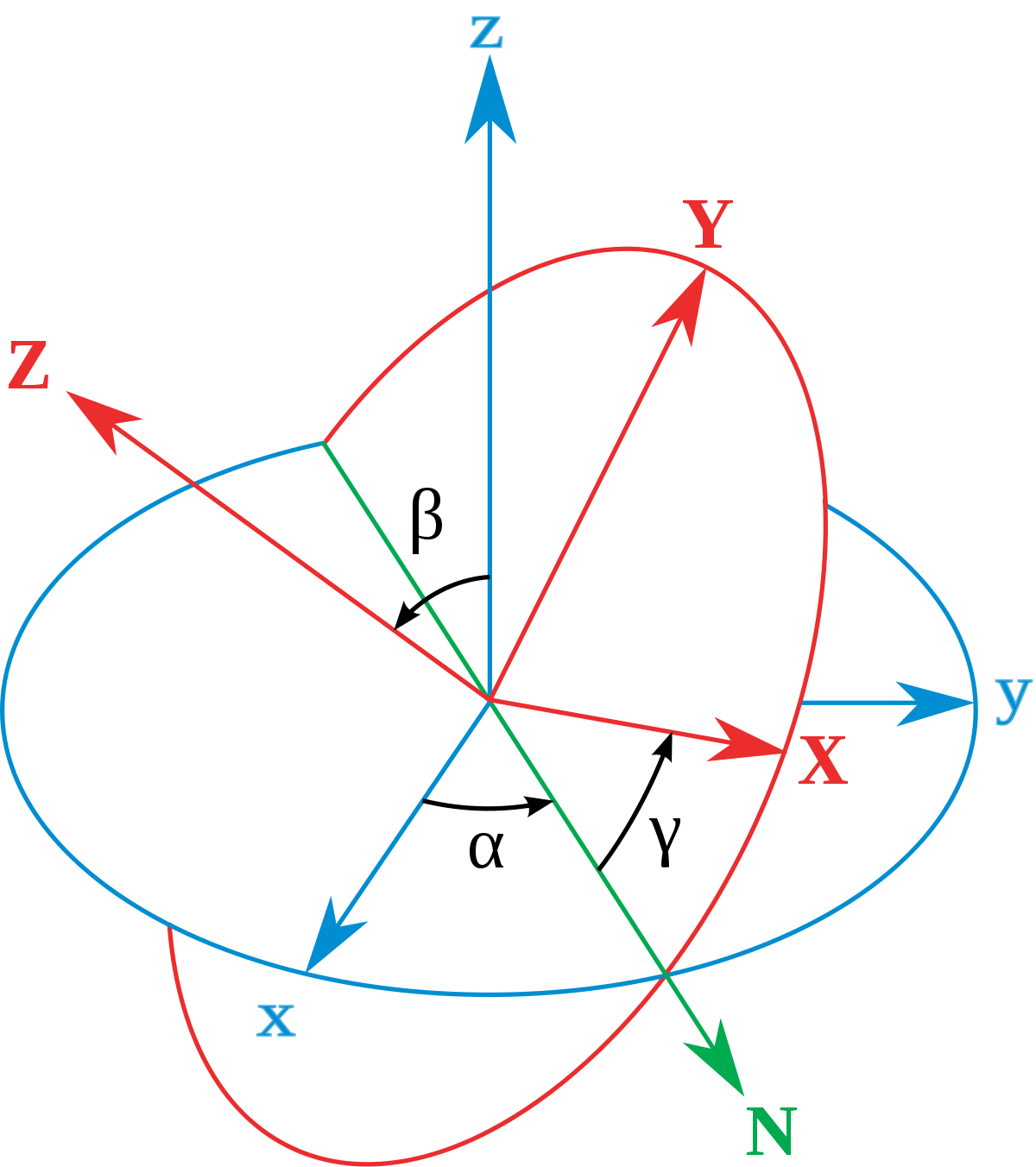
Source: Wikipedia - Euler Angles
Main Choices:
Below is a grouping I've made for different 3-D kinematic systems. This is by no means a perfect or an exhaustive list as there are plenty of other options, and combinations of options, but I feel comfortable saying 95% of existing 3-D printers can be put into one of the categories below.
Linear:
• Cartesian
• CoreXY/H-bot
• Delta
Polar:
• Basic Polar
• Scara
• Robotic Arm
Choosing Between Linear and Polar:
• Pros/Cons of Linear
One of the main reasons you'd choose a linear option is simplicity. There is a lot of pre-existing open-source support for several different types of linear systems. Another pro is that they're usually easier to troubleshoot than polar systems. They're also less likely to run into the issue of different resolutions at different positions. For a simple Cartesian setup, your resolution in any axis at any position is equal to the minimal step's relation to linear movement. A negative is that you're more likely to only have 3 degrees of freedom, being translation in X, Y, and Z. This is fine for most applications, however, you may deem that your specific purpose requires an additional rotational degree of freedom for rotation about two or three of the axis, which a robotic arm would be great for.
• Pros/Cons of Polar
Few applications are going to take advantage of the pros polar systems can provide. Pretty much the only reason you'd pick a basic polar machine is to save money on the hardware required to translate rotational motion to linear motion. It has the major issue of a reduced resolution the farther you are printing away from the center of rotation for the table. A Scara only slightly improves on this. As mentioned in the pros/cons of linear options, a robotic arm could provide an additional rotational degree of freedom in each axis
Choosing a Linear System:
Cartesian-
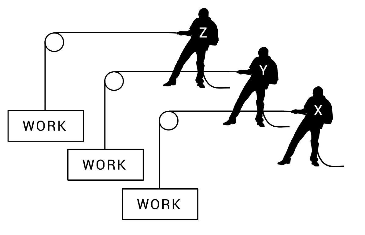
Source: Youtube - Teaching Tech
This is currently the most ubiquitous out of all linear systems, mostly due to its simplicity. There are many different ways to build them, such as an X gantry on a Z-axis with the bed moving in the Y-axis or the X-axis mounted on the Y-axis, and the bed moving in the Z-axis. Those are the two most common setups, though there are certainly many more. Each motor controls an axis individually, represented in the picture above. Another big advantage is the simplicity of their kinematic calculations, which is due to each motor affecting only 1 axis. This means a fairly cheap controller can be used. This is about the only setup I'd feel comfortable using an 8-bit setup with. The main downside is that with one axis carrying another, it can quickly add up to cause problems, for example, ghosting. Below is an example of an extremely popular Cartesian machine, the CR10. These are typically also going to be some of the most affordable printers.
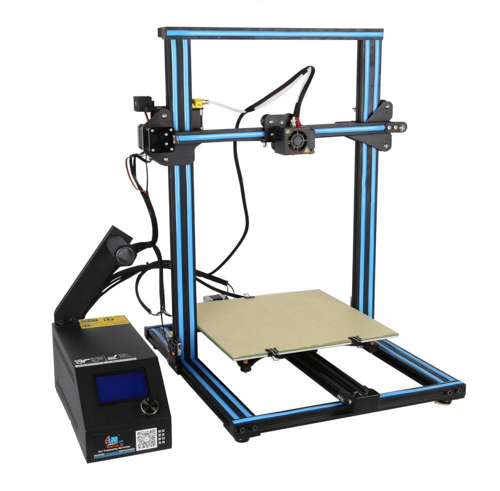
Source: Creality 3D
CoreXY/H-Bot-
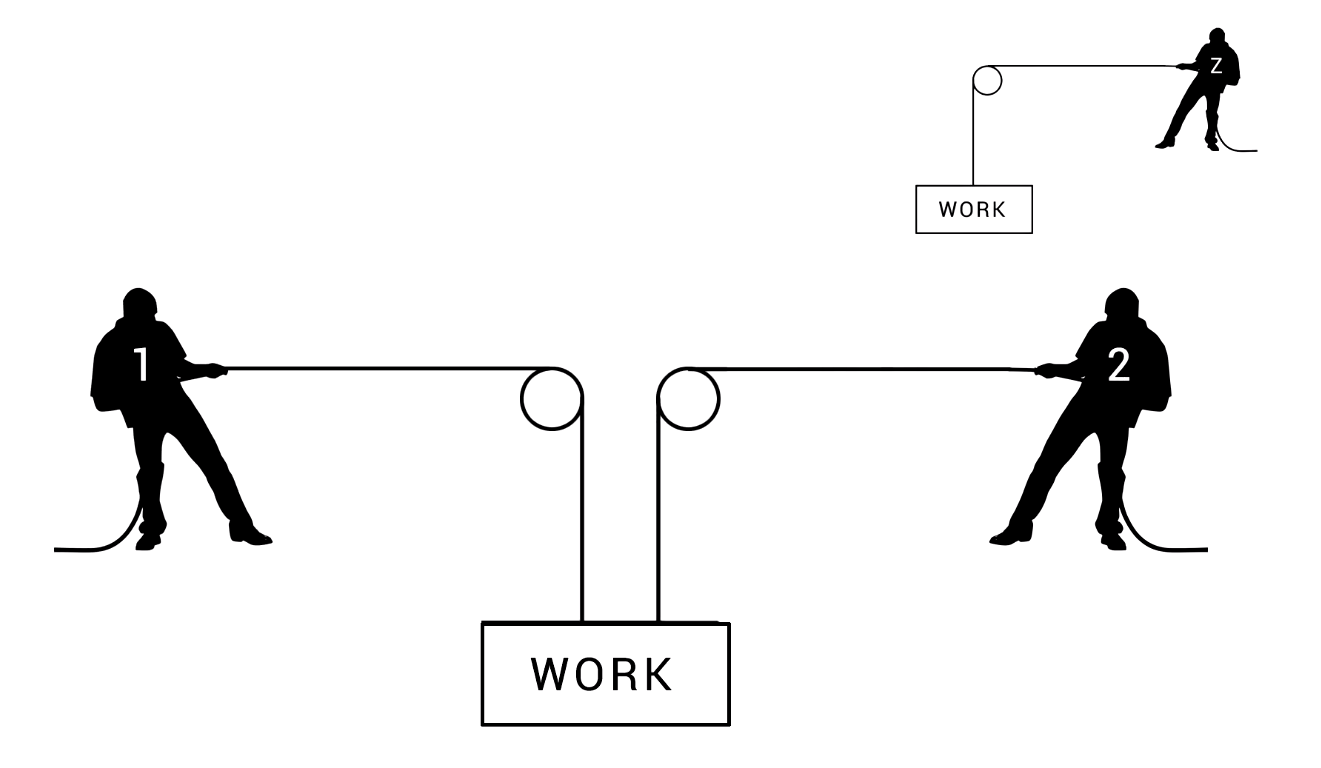
Source: Youtube - Teaching Tech
In their most popular orientation, both CoreXY and H-Bot use 2 motors in tandem to control the X and Y position of the extruder. CoreXY is becoming more popular by the day as it has many things going for it. The main thing that CoreXY and the H-Bot solve is the problem of the mass of a motor from one axis being added to another, which is a big drawback for the Cartesian setup. Below you can see a schematic of the system and where the belts are taught and slack. The belts that have to cross out of plane may seem odd though it solves a major problem that the H-Bot has. When you consider the mass of the dynamics parts it's awfully low by comparison to a Cartesian. These printers are becoming cheaper and more available, though as of right now you're going to be paying a higher price for a CoreXY of the same quality as a Cartesian.
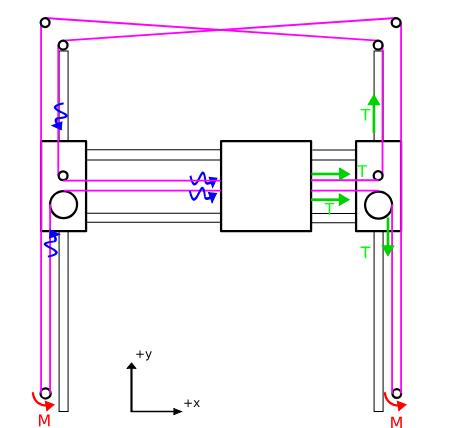
Source: Smoothieware.org
However, a closer look shows that very long belts are used to control the motion of the extruder. While the dynamic mass is reduced, due to the increased length of the belts, a much higher tension will need to be used. A problem that arises from a mixture of the belts needing to be out of plane and high belt tension is that the bearings and their supports are prone to flexing and need to be sufficiently rigid. Below is the schematic of an H-Bot.
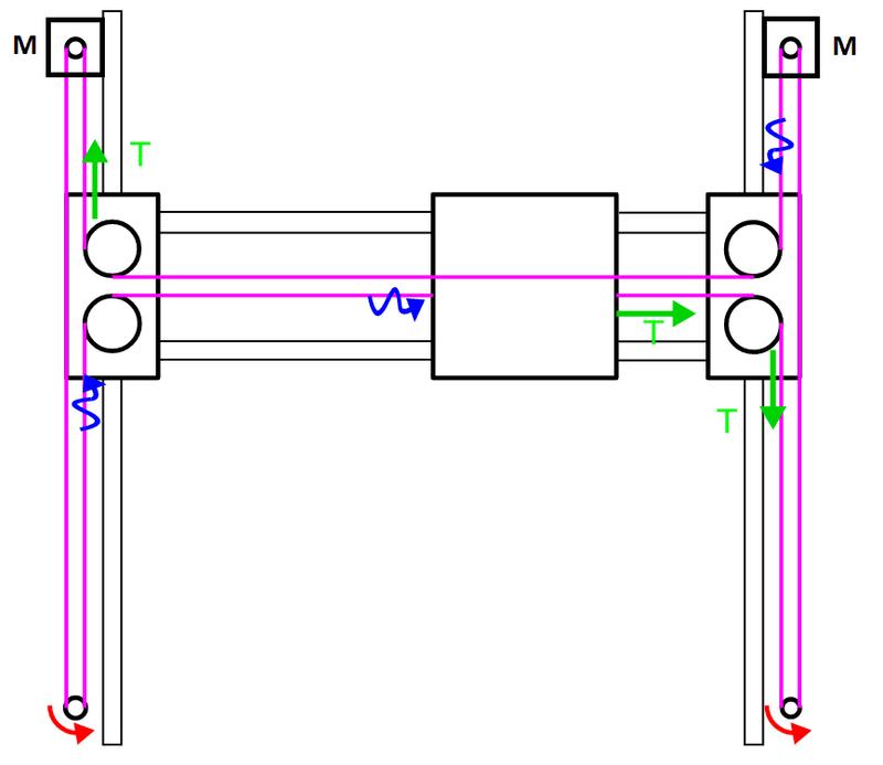
Source: Smoothieware.org
This is very similar to the CoreXY schematic, though a quick analysis of the statics and dynamics shows there will be a significant moment applied across the gantry. This is called "racking". This will act as a significant source of hysteresis/backlash and is the main reason CoreXY's are far more popular. Pretty much the only advantage the H-Bot has is that it looks cleaner. To obtain similar quality prints, the H-Bot needs to be built extremely rigidly by comparison. Below is an example of a Tronxy CoreXY printer.
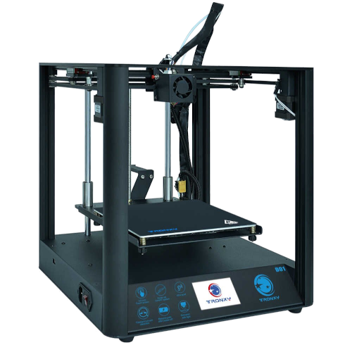
Source: Tronxy Aliexpress Store
Delta-
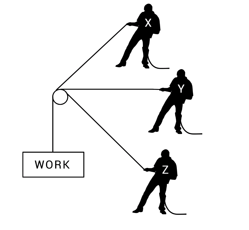
Source: Youtube - Teaching Tech
As shown above, all three motors are working in tandem to control the position of the extruder in all three axis. Of all the linear systems, the Delta probably has the most overhead for kinematics calculations. At this point, a 32-bit controller is more or less necessary, though there may be exceptions. This will add to the cost of the machine. The main reason you'd want to build a Delta is to print fast. This is due to the very low weight of the dynamics mass. There's not really any conventional gantries or moving beds. The only load on the motors is the weight of the extruder and connecting rods. A drawback of these printers is that you're mostly limited to a Bowden extruder due to the requirement of keeping the extruder a low weight, so these printers won't be friendly with flexible filaments. These printers also tend to print circular features out of round and can require a lot of fiddling. Below is an example of a popular Delta printer, the Flsun Q5.
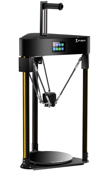
Source: Top 3D Shop
Choosing a Polar System:
Basic Polar-
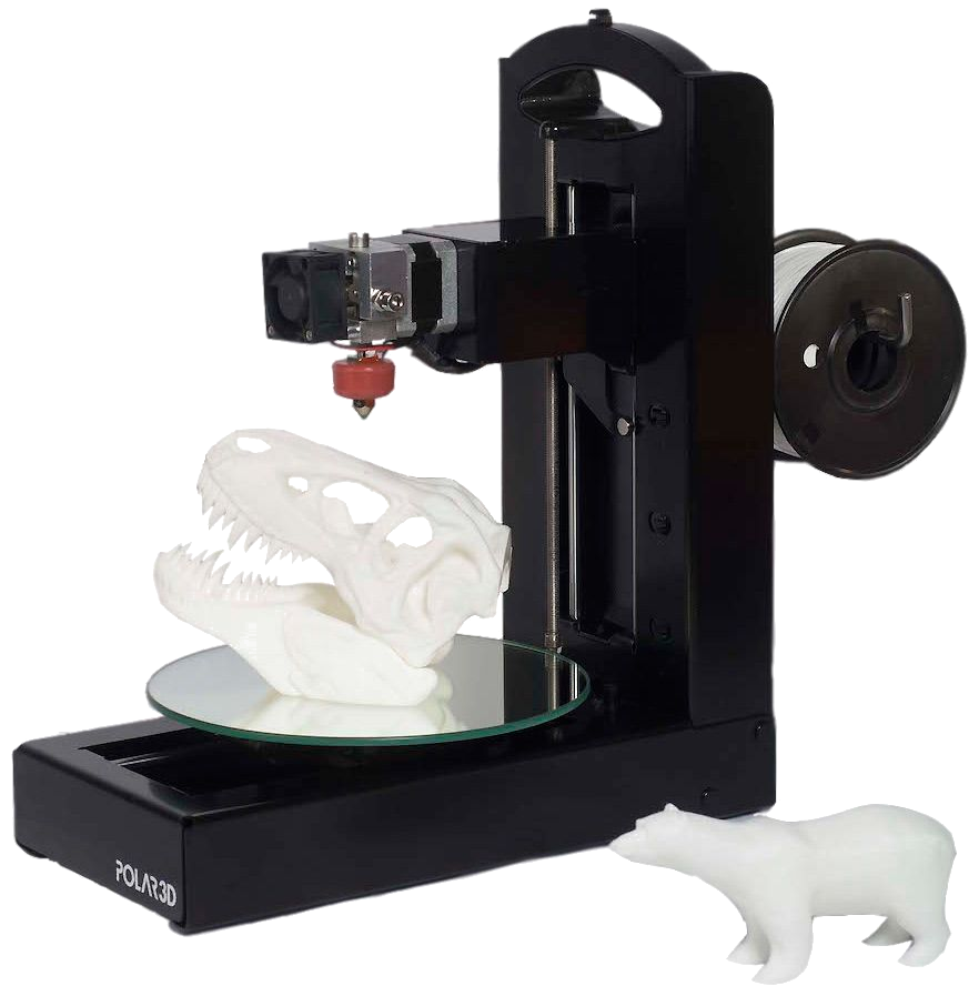
Source: Tom's Guide
These aren't particularly popular printers. The main purpose to choose this as a kinematic system is to make a machine that is even cheaper than a Cartesian. This is because it omits the hardware to convert the rotational motion of the motor to translational motion for a single axis. It comes with the drawback of a variable resolution depending on how far away you are printing from the center of the build plate. The majority of these machines are budget machines, as shown by most of the lacking even a heated bed.
Scara-
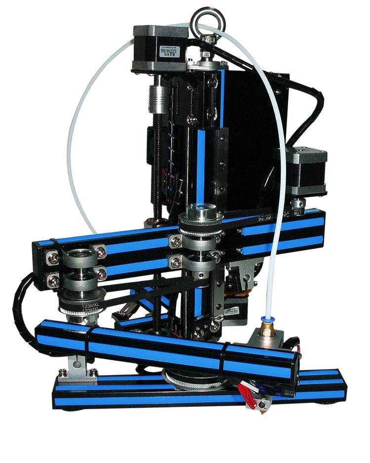
Source: Pinterest
The Scara effectively takes the Basic Polar printer a step farther and trades away the hardware from yet another linear axis. These aren't particularly popular printers either, though they have more merit than the basic polar. There's the interesting possibility of building 360° around the main post, which can lead to an extremely large build volume in comparison to the machine's overall size. If the prospect of a fairly low cost to build volume interests you, you should consider this option. It does maintain the downside of a variable resolution, however, it's slightly more complex in this example.
Robotic Arm-
Source: Dezeen
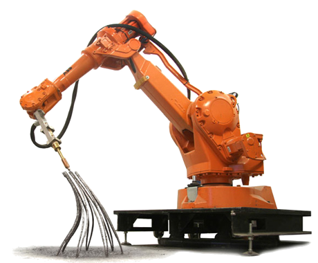
If you've got a few builds underneath your belt and are looking for something exotic, something like a 6-axis Robotic Arm could be a good choice. It provides the advantage of an even better machine footprint to build size ratio than a Scara, though it does have a few drawbacks. There aren't really any examples of hobbyist 5/6-axis robotic arm printers, they're pretty much all industrial. The cost associated with supporting several axis in series is fairly high, as well as no existing open-source support for a slicer to generate g-code for printing. However, one thing the style of this kinematic system can bring is simultaneously printing with curvature in all three axis at once, which gives you more freedom of the alignment of your layers lines. This is important since your layer lines are typically the weakest points of 3-D prints, so having more freedom in aligning them can significantly strengthen your part.
Conclusion:
The printers explored here, and more, all have their place. Some will ultimately be a more niche decision and will therefore be less popular, though that shouldn't immediately disqualify it from your selection. More 5/6-axis robotics arms could be viable in the future with cost optimization and the development of more slicer support. Scara has some interesting qualities, and the Basic Polar will likely stick around as an extremely cheap educational option. With the advent of CoreXY, H-Bot is likely to die off with exception to those already having built them in the past. CoreXY seems on track to become the defacto standard option for a kinematic system given how well it balances so many characteristics. Delta's will stay around for those that want to print fast, plus they just look fascinating while printing, so they'll continue to appeal to hobbyists. Finally, the Cartesian setups won't likely be going anywhere. Their intuitive setup and relatively low associated cost of construction and simple kinematic calculations will ensure they stay in production, though they might start to be overshadowed by the CoreXY setup. If you need additional help deciding what kinematic system you should choose for your project, you can contact me.
